
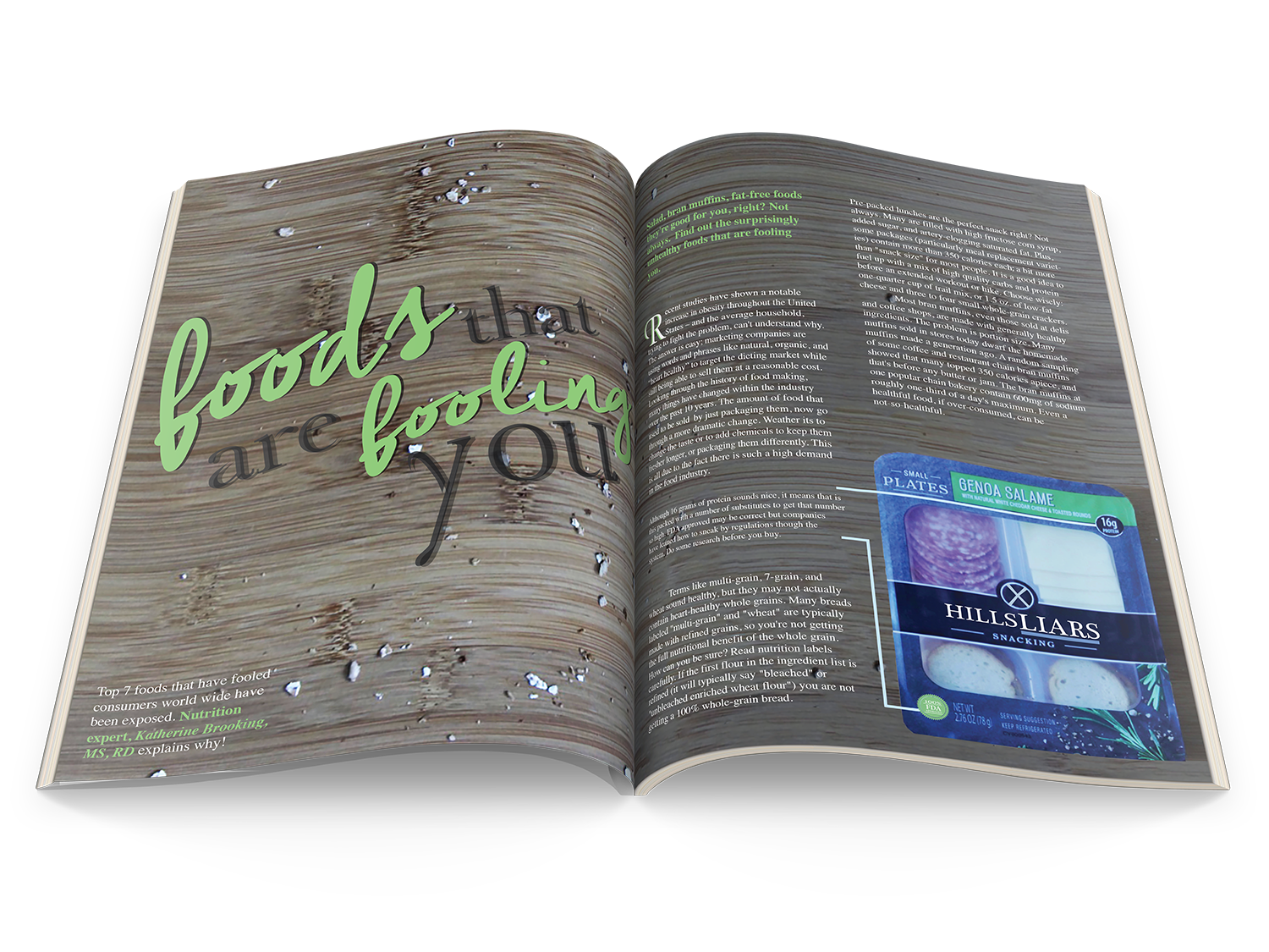
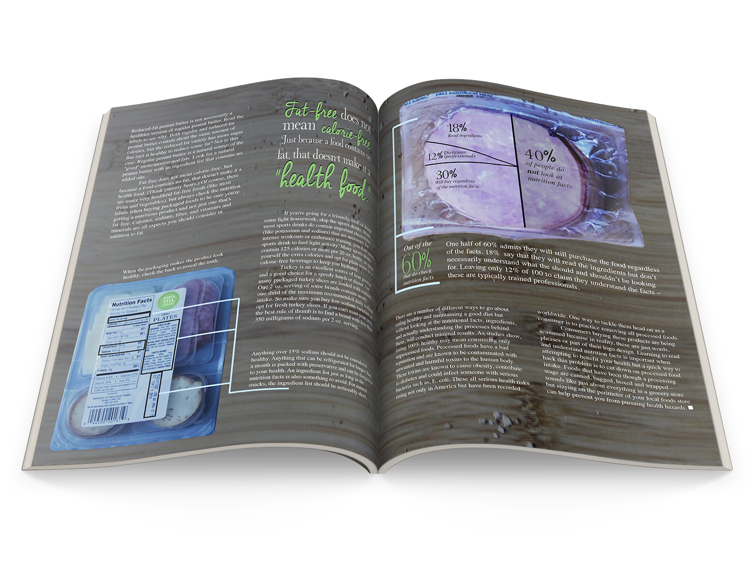
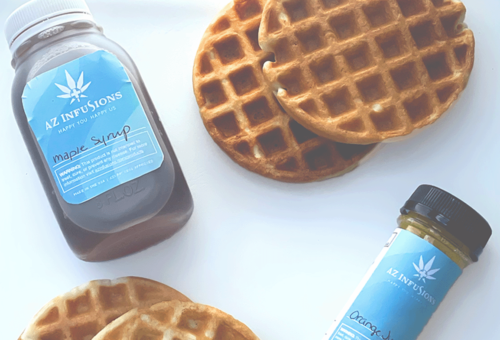
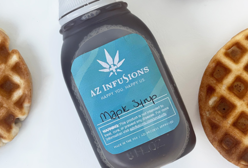
My goal was to do exactly what certain food companies do, fool the customer. This project is about foods that appear to be healthy but are not. My design choices elaborate on that by using organic elements but giving them darker tones to help the reader make the visual connection that they have a negative effect. The title specifically is meant to get the reader involved, it seems to attract attention by seeming innocent and fun, Once flipped the page, you find out otherwise. Original photography.
MORE PROJECTS

Timeless logo with a light, dark, full, and half dimensions options. This is a new project started at the begging of Fall 2021. More details and branding examples to...
Managed design projects and visuals for multiple departments within the Youngstown State University College of Creative Arts and Communications / Developed goals by communicating with team members to ensure accuracy and completion among dates agreed upon...

Handcrafted 3D text to create this one of a kind poster for the 80th Art & Design Student Exhibition. The photos were taken in the museum the event took place in. This package includes...
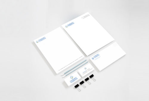
Stationery done for Community Foundation located in the Mahoning Valley of ...
One of three concepts presented to the client.
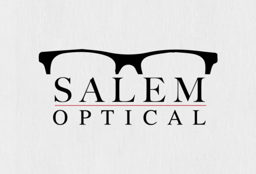
This concept is modern and groovy. This is to create a "life style" branding image. The logo portrays more personality than a standard logo . The logo...
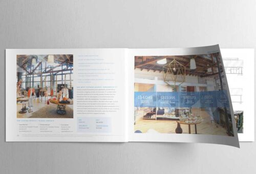
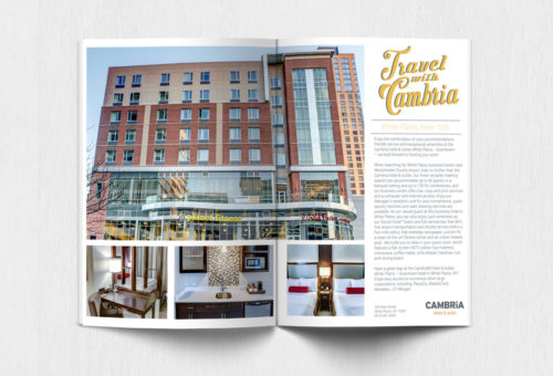
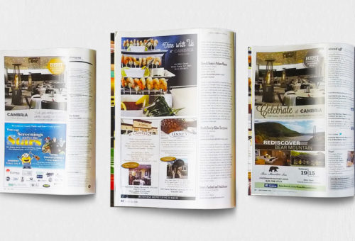
As a Marketing Manager at Rhys in Stamford, CT, I played a key role in developing and managing marketing materials to support client outreach and branding efforts. I created new templates to produce stylized...
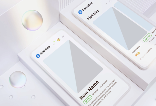
Working with a private client local to Arizona on marketing strategy and designs for non-fungible tokens (NFT).
NFT designs and company details will be shared once they become...
Created concepts, logos and packaging for all promotional material / Developed digital marketing materials for e-marketing communications / Working efficiently with a team on providing creative solutions that supported company goals, mission and culture...
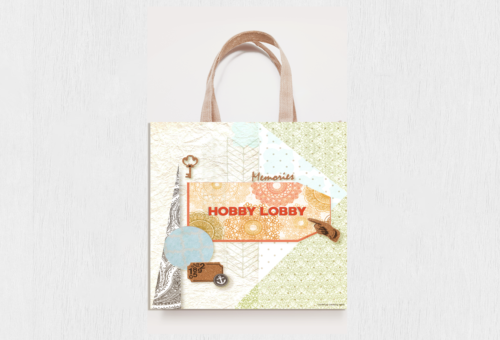
This bag has creative minds in mind.
True Story: I have gone to the craft store multiple times for paper and end up leaving with X amount of paper, a candle, a pair of scissor,...
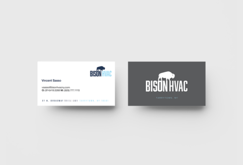
Bison Mechanical's transformation into Bison HVAC represents a significant shift in their business. The rebranding initiative reflects their commitment to staying ahead in the competitive HVAC industry. With the updated logo, Bison HVAC now...
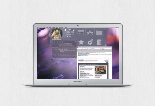
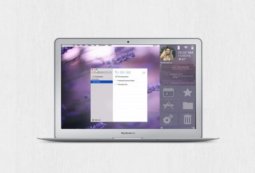
The Velocity operating system was designed with busy people who want to stay organized in mind. When I was first given this assignment I asked myself how would I be able to make my...


One of three concepts presented to the client.
This concept is clean and timeless but playful with non-permanent elements. The non-permanent elements are detailed yet dainty. They can easily be interchangeable with time, products, and...

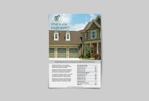
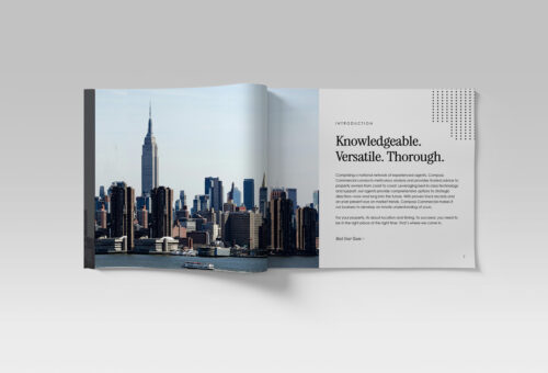
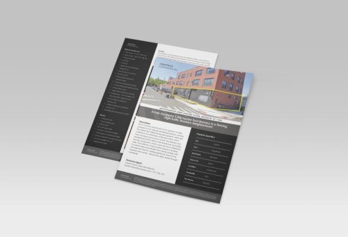
Handy one page flyers for easy distribution.
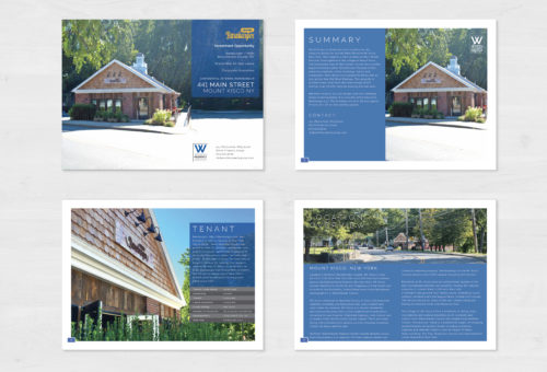
If you would like to see full pdfs or more marketing collateral done for Fairfield Appraisal Group please contact me...

Personalization request - hand done type on an existing bag for baby boy,...
Includes all 10 seasons and a display box.
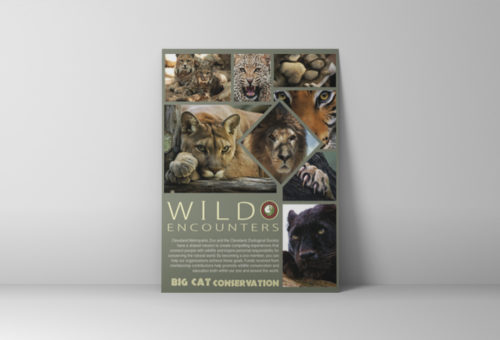
Can supply more pictures upon...
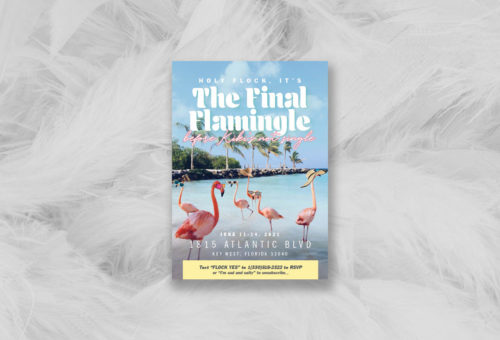
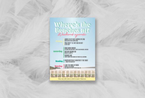
A personal touch on a special brides bachelorette party!
Some information has been distorted to respect the clients privacy.
The invite was completely custom to the bride and included a size tag, key chain, and festive...


...
Client: Jane Doe - Coding Expert
Excellent freelancer. Fast worker and knows what he's doing and his communication is very clear. Product was delivered in great shape.
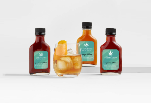
FDAQRC
Email , Interactive , Photography , Print , Social Media , Video
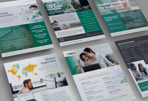
Creative Marketing & Brand Management / Remote - Global Presence / 08.2020 - Present
Hired as a Marketing Generalist in 2020 and promoted to Marketing Manager in 2022 to oversee department at full
As the leader...
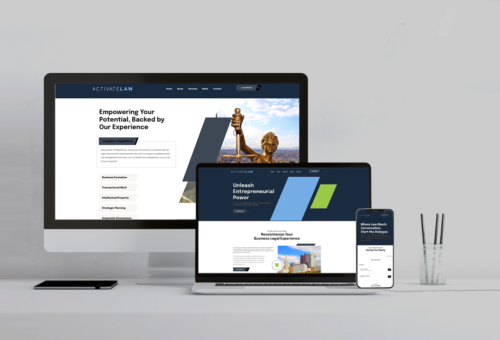
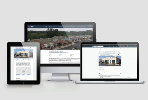
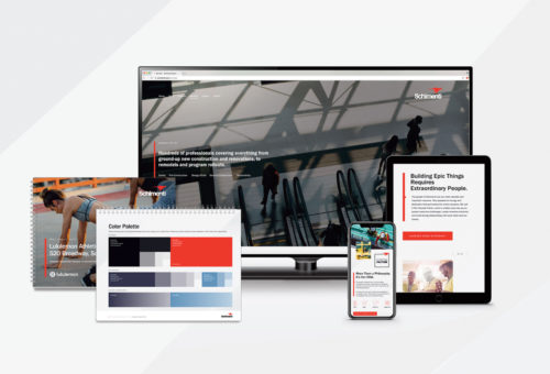
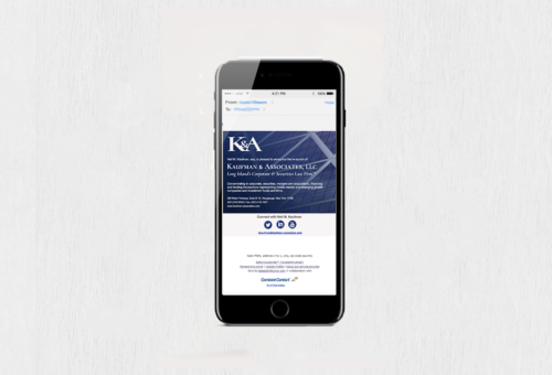
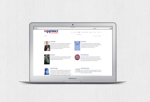
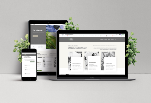
Over the course of 6 weeks, Activate.law's original Squarespace webisite was updated to an interactive WordPress site. The upgraded site features multiple pages with detailed information, engaging visuals, and interactive elements, showcasing Activate.law's services...